2023 is behind us, and so are its trends. The world of website design is ever-evolving, with designers continuously pushing the envelope to craft immersive and interactive digital experiences. From the minimalism of the 2010s to the 3D graphics of the early 2020s, website design has seen many transformations. As we journey through 2024, certain design trends have begun to dominate the landscape, each emphasizing both aesthetics and functionality. Here are the top website design trends to watch for this year:
Fluid Organic Shapes
Traditionally, websites have been anchored by rigid grid layouts. While functional and clean, often lack the nuance and dynamism needed to captivate a visitor’s attention. In stark contrast to these geometric structures, fluid organic shapes offer a softer, more spontaneous visual appeal.
These shapes, reminiscent of elements we might find in nature. They remind of water puddles, stone contours, or abstract illustrations, lend a website an organic, human touch. By breaking free from the confines of straight lines and hard corners, they convey a sense of fluidity and spontaneity. They also help to create a harmonious blend between different sections of a website. This makes transitions smoother and more intuitive for the user.
Moreover, these organic designs resonate with viewers on a psychological level. They tap into our inherent preference for nature-inspired themes and forms. In this age, digital immersion can sometimes feel cold and distant. Introducing natural, fluid shapes can create a more welcoming and relatable user experience. Pairing them with dynamic animations or subtle micro-interactions can further enhance the depth and interactivity of the website design.

Virtual Reality (VR) and Augmented Reality (AR) Integration
A melding of the physical and digital realms is happening. This phenomenon is evident in the rising integration of Virtual Reality (VR) and Augmented Reality (AR) into web experiences. These technologies, once relegated to high-end gaming and niche applications, are now in mainstream website design, reshaping how users interact.
VR and AR elevate the traditional browsing experience to a whole new level. While VR immerses users in a virtual environment, transporting them to new worlds, AR overlays information in the real world. For instance, e-commerces are using AR for users to “try on” clothes, accessories, or view furniture before buying. This not only elevates the shopping experience but also reduces the uncertainty associated with online purchases. Similarly, museums are using VR to offer virtual tours, letting users explore distant or inaccessible locales.

Dark Mode Design
With many apps and operating systems now offering dark mode, website design is following suit. One of the most compelling reasons behind the rising popularity of dark mode is its aesthetic appeal. It provides a sleek, modern, and often more visually striking appearance that stands in contrast to the traditional, predominantly white interfaces. This contrast not only lends websites a distinct visual identity but also accentuates design elements and color schemes, allowing designers to experiment and innovate.
Beyond aesthetics, the benefits of dark mode are multifaceted. From a user experience perspective, dark themes substantially reduce eye strain, especially in low-light conditions. The muted shades of dark mode lessen the glaring brightness typically associated with light-themed interfaces, offering users a more comfortable viewing experience. This is particularly beneficial for individuals who spend extended periods online or those who browse during nighttime hours.
Furthermore, on the technical side, dark mode can lead to tangible power savings, especially for devices with OLED or AMOLED screens. In such displays, pixels are individually lit, and black or dark pixels consume significantly less power compared to their brighter counterparts. As a result, adopting dark mode on websites can contribute to extended battery life for users, a feature that is increasingly vital in our mobile-centric world.

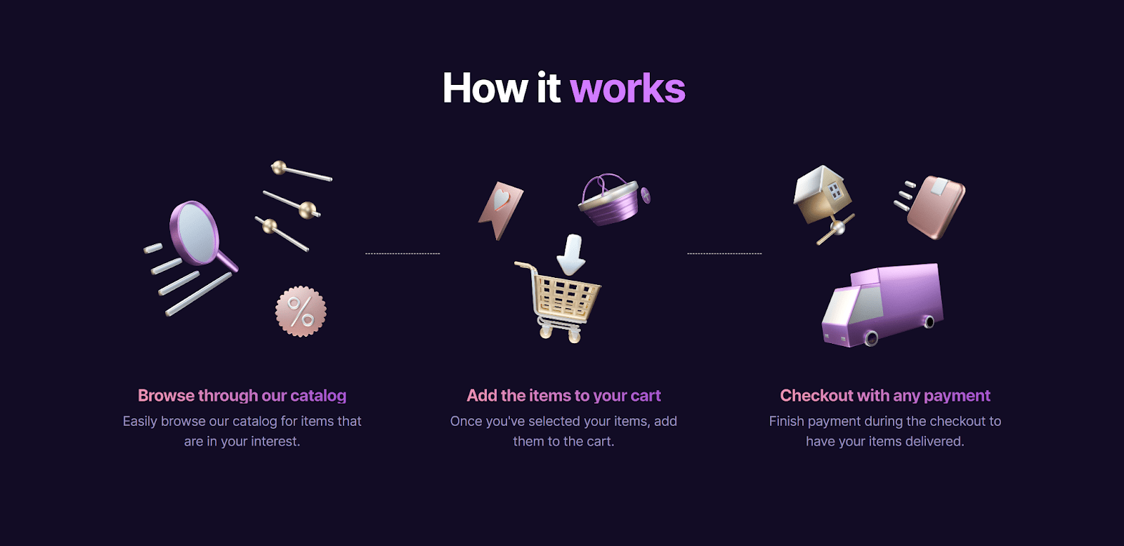
Interactive 3D Elements
3D visuals have always delighted viewers. In 2024, interactive 3D design is catching on, providing depth and a sense of realism to websites. At its core, the allure of 3D lies in its ability to simulate reality. Interactive 3D elements on websites offer viewers a multi-dimensional experience, allowing them to engage with content in a more immersive manner. Instead of being passive observers, users become active participants, able to rotate, zoom, or even “enter” these 3D spaces. This heightened level of interaction keeps users engaged for longer durations and offers a richer, more memorable browsing experience. Moreover, interactive 3D design can serve as a potent tool for storytelling. Brands can utilize these elements to craft compelling narratives, weaving in product showcases, company histories, or future visions in a 3D space. This can help in forging a deeper emotional connection with the audience, making the brand narrative more impactful with your website design.

Voice User Interface (VUI)
With the rise of voice assistants, websites are now being designed with voice command integration, making navigation more intuitive and hands-free. VUI, at its core, is centered on facilitating interaction with digital platforms through voice commands rather than traditional touch or click-based interfaces. By integrating VUI into websites, developers are offering users a hands-free, intuitive mode of navigation. This evolution moves beyond the constraints of keyboards and touchscreens, allowing users to engage in multi-tasking or access content when traditional methods might be inconvenient or inaccessible — such as while driving, cooking, or when facing mobility challenges.
The benefits of VUI-enhanced websites extend beyond mere convenience. For users with visual impairments or motor disabilities, voice commands can revolutionize their browsing experience, making the web more inclusive and accessible. Furthermore, as the global population ages, VUI can address the challenges faced by older users who might struggle with small text or intricate touch-based commands.

Micro-Animations
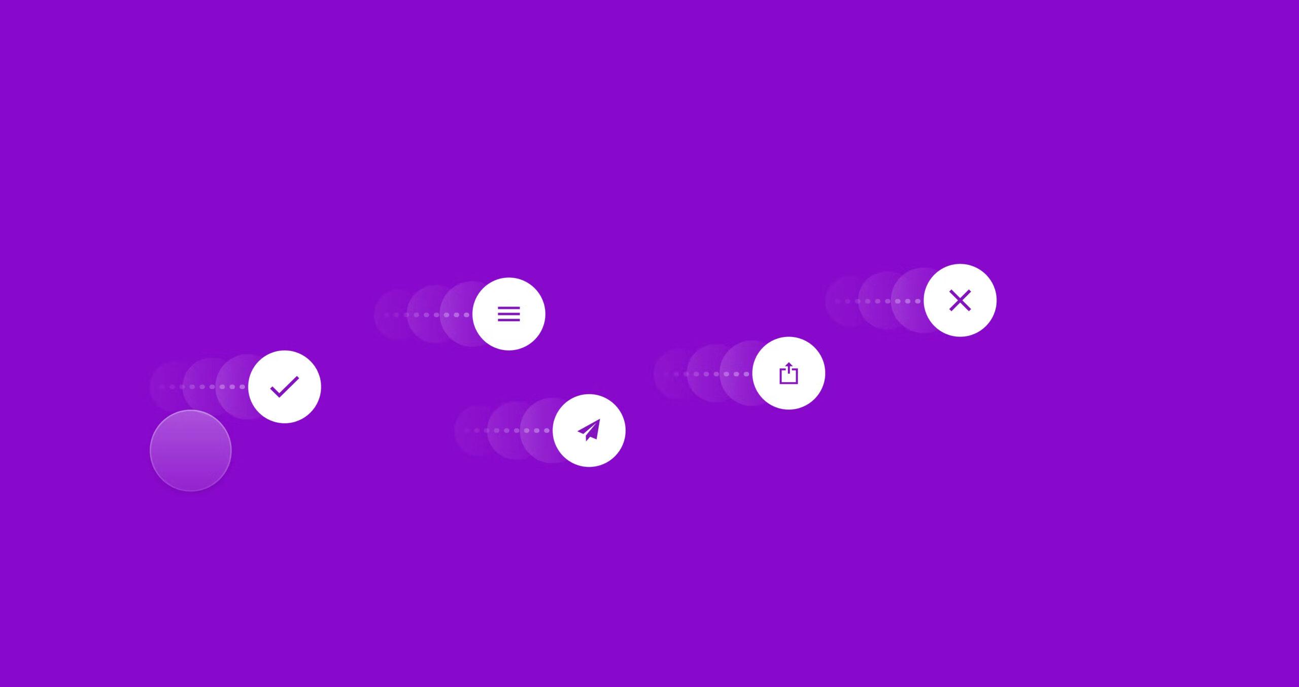
These are subtle animations that guide or inform the user, enhancing the user experience without being overly flashy. Think of icons that move or text that shifts upon a mouse hover. Micro-animations serve multiple purposes. Firstly, they act as guides. As users navigate a website or application, these animations subtly direct attention, signaling where to look or click next. For instance, a slight bounce of an arrow icon might indicate a scroll direction, or a gently pulsating button might draw attention to the next call-to-action.
Another essential function of micro-animations is feedback. In the digital space, users don’t have the tactile feedback they experience in the physical world. Micro-animations bridge this gap. When a user takes an action, like submitting a form or clicking a button, a tiny animation — such as a color shift, a tick mark appearing, or an icon briefly transforming — can confirm that the action was registered and executed. This immediate feedback reassures users that they’re on the right track and that the system is responding to their actions.

Minimalist Navigation
Simplified navigation reduces clutter and focuses on user priorities, making website interactions smooth and straightforward. Here are some of the reasons why:
- Clear Focus: By reducing the number of options and presenting only the most crucial links or buttons, websites can guide users more effectively toward desired actions, whether that’s making a purchase, signing up, or accessing specific content.
- Increased Usability: A streamlined navigation system reduces the chances of users getting lost or overwhelmed. This enhances the overall user experience, leading to higher satisfaction and lower bounce rates.
- Adaptive Design: With the increasing use of mobile devices for web browsing, minimalist navigation proves beneficial. Fewer elements mean that designs are more adaptable to smaller screens, ensuring a consistent user experience across devices.
- Enhanced Aesthetics: A clutter-free navigation bar or menu lends a modern, clean look to websites. This not only looks appealing but also aligns with contemporary design aesthetics.
- Faster Load Times: Fewer elements and simpler graphics can contribute to quicker page load times, which is vital for user retention and SEO rankings.

Multi-Scrolling Layouts
As web design continues to evolve, designers are constantly exploring innovative methods to engage users and present content in unique ways. One such method that has recently gained traction is the use of multi-scrolling layouts. This design approach divides a webpage into multiple sections or panes, each with its independent scrolling mechanism, allowing for a dynamic and layered browsing experience.
Here’s a deeper dive into the nuances and benefits of multi-scrolling layouts:
- Dynamic User Engagement: Traditional web pages are linear, requiring users to scroll through content in a predetermined sequence. Multi-scrolling layouts disrupt this monotony by offering multiple pathways and focal points. This non-linear approach encourages users to explore, increasing engagement and interaction.
- Enhanced Content Segmentation: By using independent scrolling sections, designers can segment different types of content or topics. This is especially useful for websites that have diverse content categories or wish to highlight specific sections without overwhelming the user.
- Interactive Storytelling: Multi-scrolling layouts can be employed to craft compelling narratives. For instance, while one section may display text, an adjacent section can feature complementary images or videos that change as the user scrolls, creating a multi-dimensional storytelling experience.
- Optimized for Varied Screen Sizes: With the array of device screen sizes today, from smartphones to desktop monitors, multi-scrolling offers a versatile design solution. Different sections can be tailored for optimal viewing on various devices, ensuring a consistent and immersive user experience.
- Artistic Freedom: From a design perspective, multi-scrolling layouts open up a plethora of creative possibilities. Designers can play with contrasts, synchronize content across sections, or even create intriguing visual effects as different sections scroll at varying speeds or directions.

Retro-futurism Website Design
The cyclical nature of design trends often sees styles from bygone eras making resounding comebacks, albeit with contemporary twists. One such intriguing trend resurging in the digital space is retro-futurism. Retro-futurism is a unique blend of past design elements with futuristic motifs, creating visuals that are simultaneously nostalgic and innovative. Retro-futurism offers a distinct visual language, characterized by its bold color palettes, often dominated by neon hues against dark backdrops, gleaming chrome accents, and vintage typography infused with modern design elements. These contrasting elements instantly capture attention, making websites memorable.
While retro-futurism has its design markers, it’s a flexible aesthetic. It can be adapted to various industries, from music and entertainment to tech and e-commerce. Whether it’s a subtle hint with neon button highlights or a full-fledged cyberpunk-themed website, there’s a spectrum of intensity to play with. In a digital landscape where differentiation is crucial, adopting a retro-futuristic aesthetic can set a website apart. It’s a bold statement, reflecting a brand’s willingness to be avant-garde and experiment, which can resonate with target audiences looking for fresh and innovative content.

Oversized Fonts and Elements
In the realm of modern web design, subtlety has its place, but so does audacity. One of the standout trends marking this audacious approach is the use of oversized fonts and elements. This larger-than-life design strategy doesn’t merely aim to catch the eye; it strives to command attention, ensuring that the primary message is not only seen but also remembered.
In an age of dwindling attention spans, there’s a minimal window to grab a user’s attention. Oversized fonts and elements make an immediate visual impact, drawing users into the content from the moment they land on a page. The use of large fonts can establish a clear visual hierarchy. It differentiates the primary message or headline from the secondary content, making it easier for users to quickly understand the primary focus of a page or section. If there’s a particular action you want users to take, such as signing up for a newsletter or making a purchase, an oversized button or icon can draw attention to that specific CTA, increasing the likelihood of user interaction. The choice of typography, especially when emphasized in size, can convey a lot about a brand’s personality. Whether it’s a bold, blocky font signaling strength and reliability, or a large, elegant script reflecting sophistication, oversized fonts can be pivotal in brand storytelling.

Color-Changing Gradients
Color has always been a potent tool in the designer’s arsenal, allowing for the conveyance of mood, brand identity, and visual interest. Gradients, with their smooth color transitions, have been a staple in design for years. However, as technology and design sensibilities evolve, so too have gradients. Today, dynamic color-changing gradients are infusing websites with a sense of depth, movement, and a touch of the unexpected.
Unlike static gradients, which offer a fixed transition between colors, dynamic gradients shift and evolve, often in response to user interactions or as part of an animation sequence. This fluidity can captivate users, keeping them engaged as they explore a site. The colors chosen and their transitions can evoke a spectrum of emotions. A gradient that shifts from warm oranges to deep purples might evoke a sunset, creating a feeling of calm and reflection, while a gradient oscillating between vibrant greens and blues might evoke feelings of energy and growth.

Inclusive and Accessibility Website Design
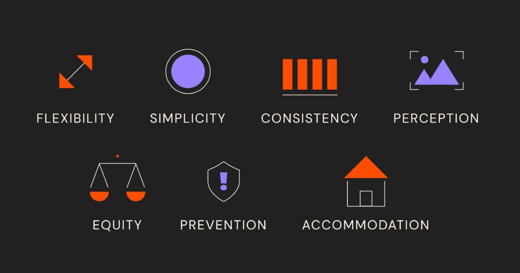
In the digital age, websites serve as essential gateways to information, services, and social interaction. As such, ensuring these platforms are accessible to all, irrespective of physical or cognitive differences, has never been more crucial. In 2024, inclusive and accessibility design has transcended from being mere industry jargon to a fundamental design principle, ensuring that digital spaces are equitable and universally engaging. Following Google’s approach to UX, 2024 focus on equitable UX is one of the big bets for this coming year, as it aims to include historically left-out audiences and communities.
At its core, accessibility design acknowledges the fundamental right of every individual to access information and services. By integrating accessibility features, designers and developers demonstrate a commitment to ethical practices that value every user.
Legally, many jurisdictions around the world have recognized the importance of digital accessibility, enacting laws and guidelines that mandate certain standards. Compliance isn’t just a matter of legality; it’s a reflection of corporate responsibility.
But beyond all, inclusivity in design goes beyond addressing apparent physical disabilities. Cognitive challenges, such as those posed by conditions like dyslexia or ADHD, are equally considered, leading to designs that cater to varied cognitive processing needs. Accessibility isn’t a one-time checklist. It requires continuous feedback from users with disabilities to refine and adapt. This iterative process ensures that as technology and user needs evolve, websites remain universally accessible.

Final thoughts
2024 is proving to be a year where designers merge innovative technology with human-centric elements. While it’s essential to be aware of these trends, always prioritize your brand’s identity and your audience’s needs. Trends come and go, but genuine connection and user satisfaction are timeless.
If you want a website that can catch up with the times, contact us!

